
Color theory forms the backbone of any solid design strategy. It’s all about blending hues, saturation, and lightness in a way that makes your visuals not just pop but actually work for you. Nothing looks worse than a mismatched dashboard that confuses more than it informs.
Getting the hang of primary, secondary, and tertiary colors is like getting to know your ABCs in design. They are the building blocks that help you create combinations that sing together rather than clash. Think of them as your go-to tools for constructing a compelling visual story.
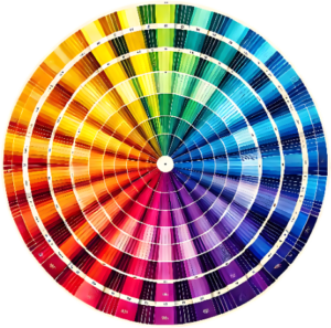
The Color Wheel—ah, that trusty guide
It introduces you to the relationships between colors, like complementary, analogous, and triadic color schemes. Using it wisely can really bring out the best in your dashboard visuals, adding clarity and visual interest.
Color harmony, though, is where the magic happens.
A balanced palette that’s easy on the eyes can make your dashboard not just a tool but an engaging experience.
This is where skilled designers shine, pulling together all the elements for an overall design that doesn’t just tell you data but whispers sweet insights.
Psychology of Color: Impact on User Experience and Decision Making
Colors aren’t just pretty to look at; they’re busy working behind the scenes, influencing how we feel and behave. They play a sneaky yet potent role in shaping our interactions with dashboards. Pick the right colors, and your users might not even hit snooze on those early morning meetings.
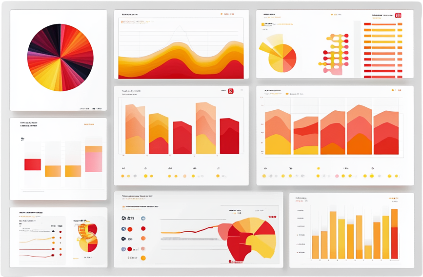
Warm colors like reds, oranges, and yellows can fuel energy and urgency
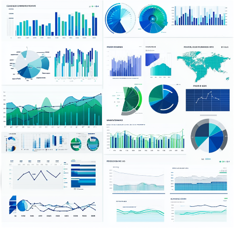
On the flip side, cool colors such as blues and greens can calm the mind and help focus on data over the long haul.
It’s all about striking the right emotional tone with your dashboard design.
Cultural perceptions of color can throw a curveball into the mix, too. A color that screams success in one culture might whisper something entirely different in another. Understanding these nuances can mean the difference between connecting with your users or leaving them a bit puzzled.
The real kicker comes with minimizing cognitive load. When your colors work together to highlight the most crucial info, your users will hardly sweat finding what they need. It’s like having a helpful signpost at every turn in a well-designed amusement park—not overwhelming, just right.
Implementing Color in Dashboard Design: Best Practices and Considerations
Crafting a color palette for your dashboard is all about consistency and accessibility. Think of it as building a wardrobe—mix and match styles that blend well but also speak to different occasions.
Your colors should do some heavy lifting, spotlighting key metrics and patterns. Good use of color makes important data jump out effortlessly, directing users’ attention where it’s needed the most.
Aesthetics and functionality need to balance like a tightrope walker. While a splash of color is great, going overboard can tank your dashboard’s effectiveness. Less is often more when it comes to color saturation.
Designing with accessibility in mind isn’t just a buzzword; it’s a must-have. Meeting the Web Content Accessibility Guidelines (WCAG) means more people can interact with your dashboard without a hitch.
Future Trends in Color Theory and Dashboard Design: Innovations and Predictions
The design world is buzzing with new trends, and dashboards are no exception. Dynamic and adaptive color schemes are stepping into the limelight, letting dashboards change colors based on data or user preferences. It’s like having a mood ring that adapts to what your users need at any moment.
AI and machine learning aren’t just tech buzzwords—they’re revolutionizing how we personalize color experiences across dashboards. Imagine a dashboard that tweaks its colors in real-time for individual preferences—making it feel tailor-made just for the user.
As if VR and AR weren’t futuristic enough, they’re now playing a big role in how colors enhance user interaction. These technologies are opening up new avenues for using color in ways we couldn’t even imagine a few years ago.